The Rare book room was quite a trip actually. From the moment I entered the room the aesthetics surrounding me truly enveloped me into the world of print. The room felt very aged, with the dark wood walls, to the dark shade of the floor.
The prints themselves were incredible. The fact I could physically touch a book printed from the 1500's was almost surreal. The leaf of the Gutenberg bible was a little underwhelming for me, however I think of it kind of like the Mona Lisa. It may seem like nothing much but behind the face value, lies a piece of work that is not only typographically incredible but so old in age.
It was fantastic to also have a visual perspective of some of the works that I discussed in my presentation like Robert Thorne. The most interesting and enthralling piece I saw inside however were the wooden print blocks. All I could think about was being able to go and actually print a sentence or two with those blocks and keep the print as a piece of art. Something about the originality of the print and how it's made makes it so much more enticing and beautiful.
Monday, October 17, 2011

Wednesday, October 12, 2011
Periodic Table of Typography
Well this is just classical and great. I would follow the link to read more about the table and how it is organized. Characteristics that are noted for categorization are Serif, Sans Serif, Script, Blackletter, Humanist, Realist. They organized and ranked the type faces as well by how much they were used by doing research, however this is of course up to your own perception to a certain extent. Helvetica is ranked number 1, and I would believe that is the most popular in many facets.
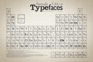

Here is the link, to read it more and check out where they got their sources from.
http://www.behance.net/Gallery/Periodic-Table-of-Typefaces/193759
Wednesday, October 5, 2011
Movie Typography
While searching for art that I wanted for my room, I remembered a site called society 6. It's a website and online store where artists can go on, and publish their work and have it produced for sale. I have bought a few pieces off it before, and recently while searching for new art I saw there was a typography section. One specific artist named Jerod Gibson has taken the task of taking some fantastic movies, and then typographically associating lines into a shape that is familiar with the movie. My favorite was this Fight Club one. All the type is crammed into a pink soap bar. The font is a Sans Serif, and is in all caps. If i'm guessing correctly as well it seems to a condensed or extra condensed variation of the font as well.
Here is the piece
 And here is the link to Jerod Gibsons profile page on Society6.com
http://society6.com/artist/jerodgibson
Here is the piece

http://society6.com/artist/jerodgibson
Thursday, September 29, 2011
A bit of typography humor
This is great, and I have to agree with this statement. It only really works with "pretty serifs"
http://cdn.twentytwowords.com/wp-content/uploads/Needs-a-good-serif-font.png
http://cdn.twentytwowords.com/wp-content/uploads/Needs-a-good-serif-font.png

Monday, September 19, 2011
WHaT TyPE arE you?
http://www.pentagram.com/what-type-are-you/
A simple, funny accented man telling you through pre recorded scenes what kind of type you are. So the question is, what kind of type are you?
A simple, funny accented man telling you through pre recorded scenes what kind of type you are. So the question is, what kind of type are you?
Wednesday, September 14, 2011
Mrs Eaves
Named after John Baskervilles wife, Mrs Eaves to me is personally one of the most pleasing and legible type faces. It comes off as elegant (as it should for being named after a woman) but is also strong. I don't read to often however if I was to read a novel or short story, I would love to have the book printed with Mrs Eaves Roman. I first found this type face when reading through a required text for typograhpy and if this type face wasn't going to run away with $40+ dollars of mine, I would love to be able to write with it digitally.
Here are some examples of the type face, where you can also change examples of your text, see all the different variations and how it is affected by changing pt size.
http://new.myfonts.com/fonts/emigre/mrs-eaves/

Here are some examples of the type face, where you can also change examples of your text, see all the different variations and how it is affected by changing pt size.
http://new.myfonts.com/fonts/emigre/mrs-eaves/
Wednesday, September 7, 2011
Crowley Web

While typing in "Typography sites" into Google, I found a page that had what they believed to be 15 of the best typographical sites on the web. As I scrolled my mouse down the page, my eye was caught by Crowleyweb.com. It is the website for an Ad agency in Buffalo NY. To the point though, their whole sales point of what makes them unique is that they have the work ethic of "blue collars" with a "white collar business". The graphic that is posted on their Agency tab on the site is superb. It has a very 1950's feel to it, both in the colors, and the type face used.
Subscribe to:
Posts (Atom)